Photo Composition: Fill the Frame

Perhaps the most fundamental step in photographic composition is deciding what to include in your image and what to exclude. Most novice photographers make the mistake of including too much extra “stuff” in their photos: too much background, too many people, and even too much of the subject. Including extra detail in the image frequently distracts the viewer from the subject and creates an image that is too “busy” to have impact.

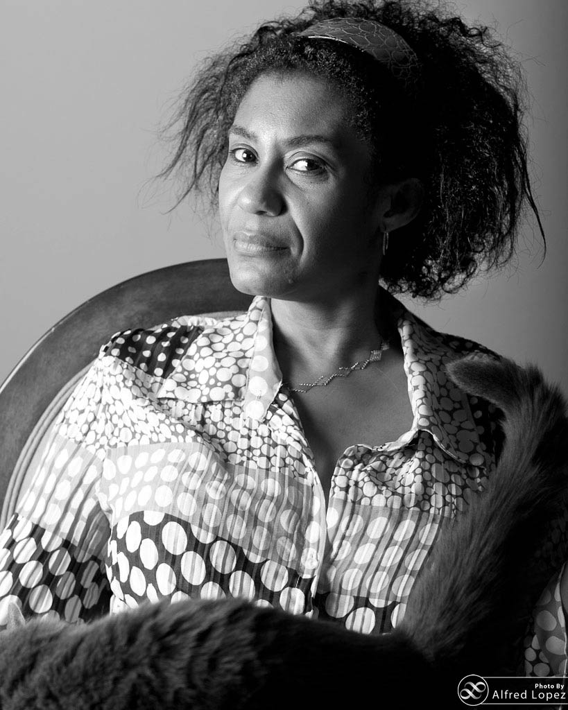
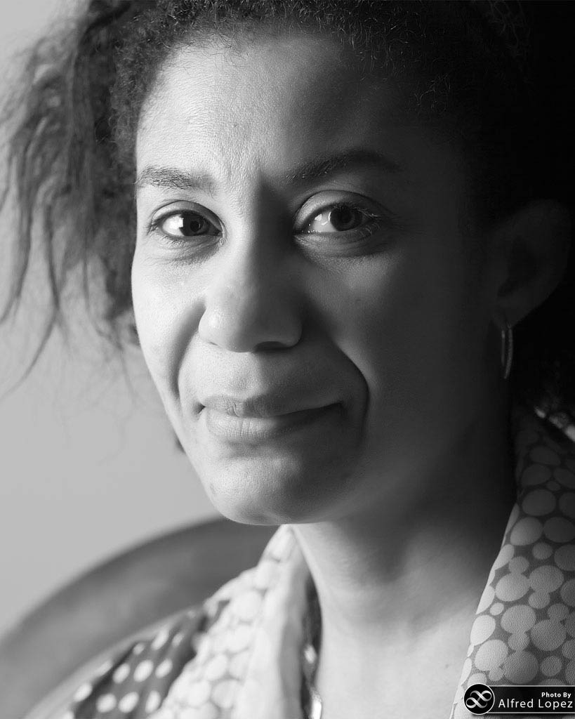
So, a general rule is: Unless you have a good reason to do otherwise, you should fill as much of the frame as possible with your subject.

The photo editor at the Seattle Times told me (at a seminar, when I was still in high school) that any time I find myself wanting to step back from my subject, or zoom-out, I should stop and compose a photo where I am. Being visually close to a subject or situation helps the viewer to feel physically close and emotionally connected, and of course, it allows us to see expressions and details that we’d otherwise miss.

Hannah, Filling the Frame
This wasn’t a planned portrait, so I shot it tight to remove distracting elements in the background.
Hannah, not filling the Frame
Before moving closer and cropping.

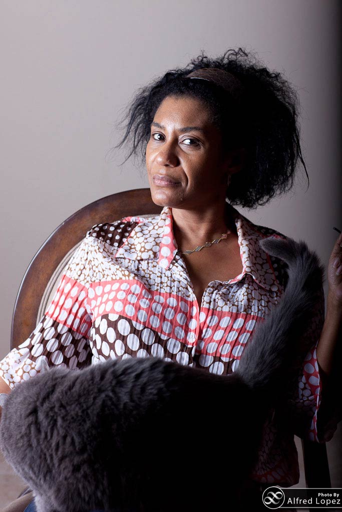
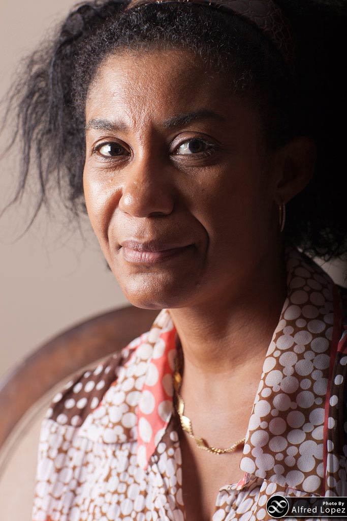
Of course, there are plenty of good reasons to do otherwise, and they depend heavily on what you’re trying to accomplish with your photograph. In portraiture, don’t be afraid to crop off part of your subject’s head and focus entirely on the features of the face… unless you’re doing an environmental portrait, and are trying to say something about the subject by showing his or her surroundings, for example.

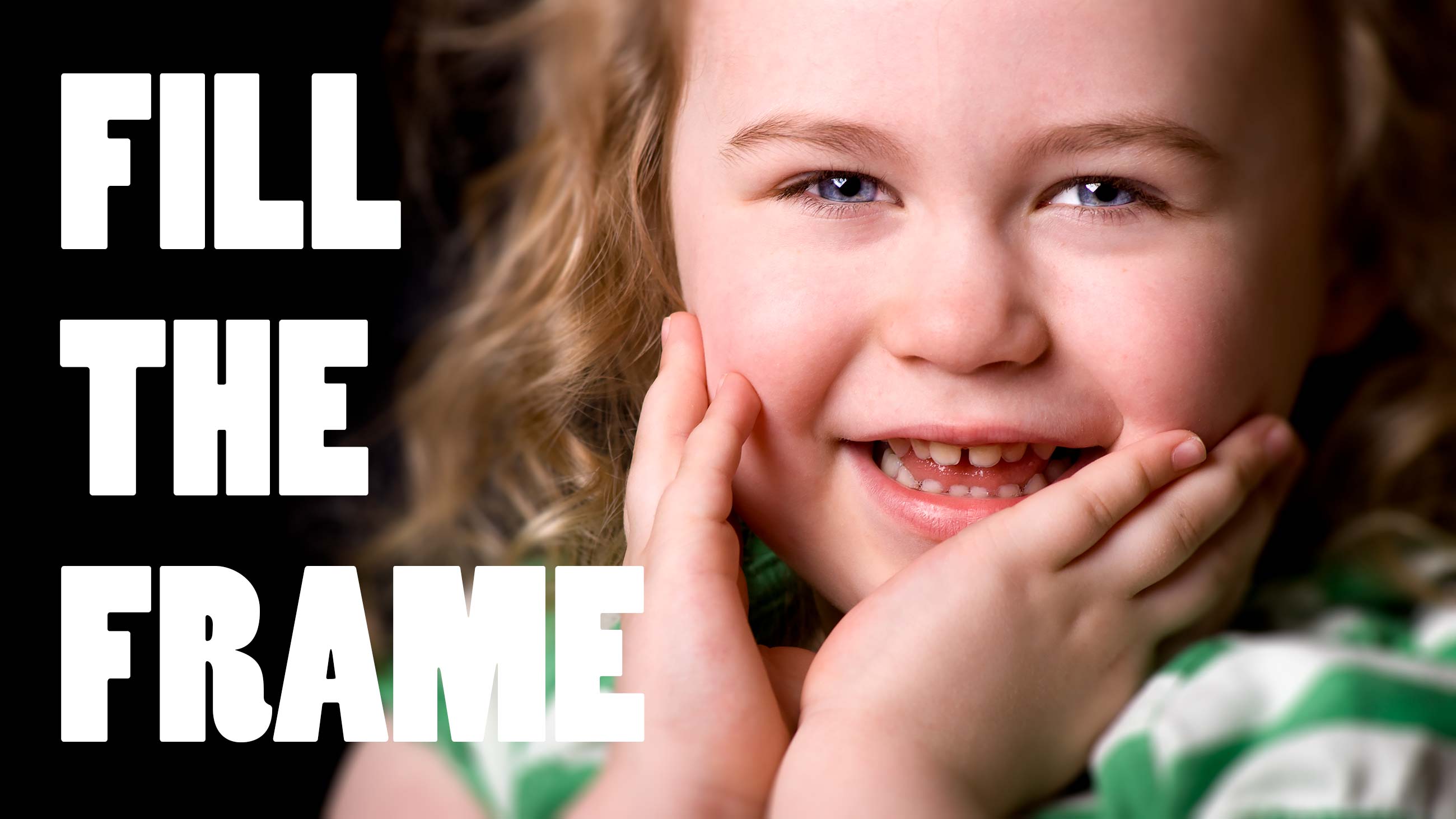
As you can see in the photo to the right, though, sometimes a very average-looking scene can produce a nice little portrait (above) if you focus on what’s really important in the image, and of course, the light. In this case, I had set up lights for a shot nearby, but I noticed that the light was spilling onto Hannah, who was sitting in front of the fireplace and watching what I was doing… and she didn’t run away when I turned my camera in her direction.

When composing a photograph I look at all of the areas surrounding the subject (or if there isn’t a well defined subject, I simply evaluate each unit in an imaginary grid) and ask myself:

  1. Does this area add anything to the story I’m telling with the image? Does this area tell me anything about the subject?
  2. Is this area visually distracting from the subject, or is it interesting enough to be made a co-subject of the photo?
  3. Can I crop this area out of the photo and still maintain the balance and feeling conveyed by the image?

In some cases, especially when you don’t have time to compose in the field, you’ll have to fill your frame by cropping in post production… sometimes quite heavily. That’s ok. Remember, it’s always better to get a great photo that you have to print small than to only get a mediocre shot that’s not worth printing at all.

And don’t forget that you should also be combining this rule with the others, when applicable: with portraits, for example, you may still benefit from placing the subject’s eyes on one of the “thirds” lines.

Egret composed to fill the frame
Upon finding my subject, I used a telephoto to get closer and fill the frame with what I thought was most important, while removing distracting elements. And, of course, I reduced the exposure to capture the highlight detail, which also darkened the background.

Examples!

Again, rather than filling this gallery with my own images, I’d like to see some of yours!  They don’t need to be artistically or technically perfect… simply email me your photo (any size) that is a clear example of “Filling the Frame”, and I’ll add it to the gallery below. Please also include how you’d like your name to appear in the byline, either as your username here, or your real name. If it helps illustrate what you’ve done, submit two photos, either an original and a cropped version of the same shot, or two photos from the same shoot that show the improvement made by filling the frame.

Space Needle and the Seattle Skyline
The Space Needle was really the focal point of this skyline shot, so I used it’s height as a guide. A wider shot would have left empty space at the top and bottom, which I thought would detract from the image.

Seattle Skyline, Rainbow, Puget Sound

Editor-in-Chief
    1. Hi Amgad,

      Thanks, glad you liked them. I’d have to look up the details, but they were taken with a variety of lenses and cameras. The first two portraits and the tighter seattle skyline were probably taken with a Nikon D80 or D300, with a 70-200 f2.8 lens, but the top portrait may have been taken with a Nikkor 105mm f2.8.

      – Matt

    1. Hi Shaza,

      Of course :) First of all, you’ve captured a very nice moment. It’s not the typical “staring at the camera and smiling” photo, and I like how the eyes and the covered mouth create a little mystery; it makes me want to know what’s going on to the camera-left of the frame. And of course, cute children are always good photographic subjects :)

      Your composition is a little unconventional; in this case, the tight crop of the left and the open space on the right create a feeling of un-balance, which in this photo makes sense with the expression, but is still a bit unsettling. Taking the “Fill the Frame” article into consideration, I think you’re half-way there with this shot; this photo is really about the girl’s expression, so cropping in to the top of her face or head and perhaps the top button of her shirt on the bottom might make for a more focused (figuratively) photo.

      I do like the fact that you used fill-flash on the shot instead of using full power, which would have created harsh shadows. There are a couple of little technical issues: there’s a little motion blur, for example… but these are minor details that will be remedied with more practice.

      Feel free to start a thread in the Forum if you’d like to hear my thoughts (and other members) on other photos!

      – Matthew

      1. Having taken a second look at your photo, I see that it’s not motion blur… looks like the focus point wasj ust lower on the body, instead of the eyes. It’s a good idea to get in the habit of focusing on the eyes :)

        – Matt

        1. thanx matt for the comment :) btw , what do u mean is i must more focused on the subject which include her face , and a little of her shirt in my picture ? no need the background ? the reason im taking like this style is only to show the blur background there . coz im practising to make the bokeh photoshoot style :)

          1. Hey Shaza,

            I didn’t mean that it was necessary, only that it was another option… since I was talking about it in the article above. If you were intentionally leaving background for bokeh, I can certainly understand your composition a little better :)

    2. Greetings Shaza,

      I know you specifically asked Matt (I feel jealous :-) ), but here are my thoughts:

      Subject-wise, it is very nice. The unbalanced feel that Matt mentioned is very evident. That was the first thing that I noticed. With that said, not knowing what your true intentions were for this shot, I would assume that you wanted to introduce “negative space”. If you were, then I would take ALL of Matt’s points into consideration (no need to repeat them here :-) ). In addition to that, I probably would have shot in landscape orientation and put the subject on the right of the frame like this or this. Keep in mind (and this is VERY subjective) that the “negative space” should be appealing, complementary to the subject and not distracting. Essentially, if the “negative space” (or background) can stand on it’s own without being too interesting, then it’s a good candidate for “negative space”.

      In this example, I felt the wall could stand on it’s own in a photo and would complement my daughter’s clothing. So I used her as a “focal point” (even though she *is* the subject) to the photo making the whole photo the subject. Clear? No? I told you it was subjective.

      The reason why I would put your subject on the right is due to the expression (or the intent of the expression) as opposed to where she’s looking at (though that is also a factor). This photo incorporates the same wall, but this time, my then future son-on-law, is looking casually (essentially without intent) towards his right just like your subject. I felt, in this case, that I wanted the wall to be complimentary as opposed to ambiguous. In other words, I didn’t want the viewer to ask “is he looking at something along the wall?”

      Hope this helps. (I actually confused myself with all that. :-) )

      Alfred

      1. thnx alfred :) btw, i wanna ask u , is it not ok if we put the subject on our left side ? can u explain ? im not really get it .

        1. Shaza,

          It really doesn’t matter where you put your subject as long as it’s pleasing. I was just giving you *my* reasons why I would place the subject on the right side. Remember, these decisions are very subjective and it boils down to the photographer’s taste.

          Cheers,

          Alfred

    1. Hey Mike, this is a great shot :) That hat, incidentally, reminds me of the one that you wore in Italy, now and then… remember that thing?

      I have the same issue with cropping parts of my subject out of the frame. It’s very hard for me. The hard part is, there are something that really unsettle the balance if you crop them partially… like hands in a portrait; they generally should be in, or out, but partial hands just seem wrong. I feel the same way about ears… but maybe that’s just me :)

    1. Sometimes, but it doesn’t have to. When you’re taking a photo of someone’s face, the eyes (or the near eye) usually become the point of focus, and you can place the eyes on one of the thirds lines. You may have noticed that I pretty commonly break the rule of thirds and place the subject closer to the edge… and I’ve done that here to some extent… which is just a peculiarity of my own work, I guess… and shouldn’t be the basis of a rule :)

      Keep in mind that the rule of thirds is just a guideline… if you have any conscious compositional reason to break it, go ahead. Think of the rule of thirds as a default position only, not necessarily the ideal.

      1. Gotcha. I’m just not creative in any way, shape, or form, so I need all the help I can get! :P

        Love the shots in the article though, nice work!

          1. Beautiful! And another example of what I was just mentioning to Mike… if you’d cropped that necklace a little higher, I would have found it unsettling; as is, though, it closes the loop and keeps the eye from wandering off the image.

Your email address will not be published. Required fields are marked *