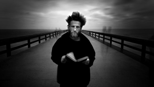
MG: So on an image like The Angel Gabriel, I see quite a bit of vignetting. Does that come from stacking the ND filters, or is that just something you’ve added in post processing?
Cole: No, that’s all dodging and burning. My post processing really consists of converting an image to black and white, and then dodging and burning and adjusting contrast. I shoot in black and white mode, but I always shoot RAW, which retains all of the color information. Then I work just like I did in the darkroom, I dodge and I burn. I don’t use any special RIPs [Raster Image Processors, a type of optimization software for printers], I don’t use any special black and white conversions, I don’t use layers or curves. I dodge and burn on a graphics tablet.
MG: What about papers? Do you have a few favorite papers, or do you experiment a lot?
Cole: I don’t experiment much, and here’s why: I have friends who, for years, have never produced their prints yet, because they’re looking for THE perfect paper. There is no perfect papers, and as fast as you can test them, new ones are coming out. So I really just use two papers: I use Hahnemuehle Photo Rag 308 for my matte stuff, and Exhibition Fibre for my glossy work.
MG: How do you decide whether you’re going to print something glossy or matte?
Cole: A lot of it’s the image, and just how it feels. I like the Photo Rag 308 because it has a nice texture and a great black, but for some images a glossy paper will give you better blacks and better sharpness, although under glass, it doesn’t really matter much.
MG: And what about the printer?
Cole: For me, if you’re printing black and white, you have to go with K3 inks, so that’s Epson. I use the 7900. There are a million things… some people say that if you use RIPs you’d get better this, and if you use a black and white conversion program, you’d get better that… they can go through a whole list of things… but in my opinion, all of those things that they spend time and money on are lucky to improve the quality of their print by one or two percent, so I just keep it really simple. I tell people, Learn the basics first, then, if you have the time and money, then worry about those things… you can do so much with a copy of Photoshop and a digitizer tablet, and nothing else!
MG: Tell me a bit about your “Fountainhead” series.
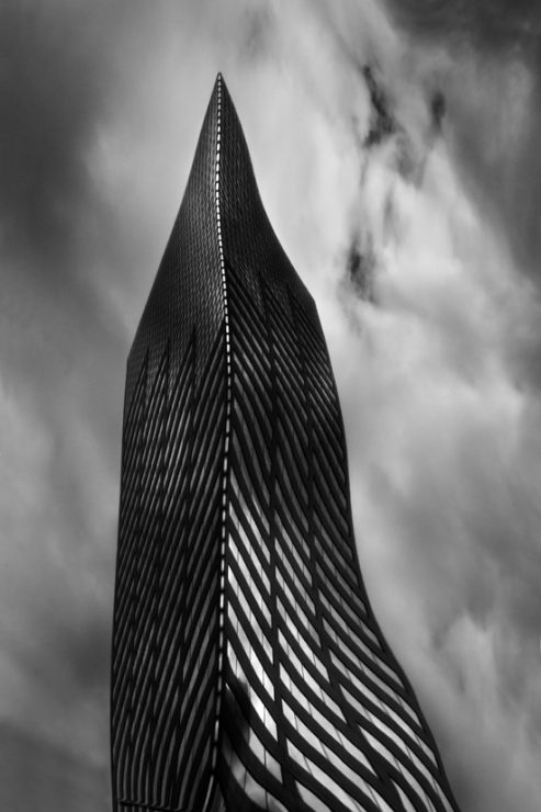
Cole: My first love in life, even before photography, was architecture. I wanted to be an architect. And then photography came along, and even more recently in life, I became familiar with the novel The Fountainhead. Really, the story in The Fountainhead is about an architect who wants to design these very modern buildings in a neoclassical world, and the pressure in the story is for him to conform and build buildings that society would like, so the whole story is about him being an individual and defining success in his own terms. The Fountainhead series, for me, was a chance to do both some architectural work and distorted work, to create these ultra-modern images of these really square buildings… and I guess to pay tribute to the book a little bit.

MG: The first time I looked at them I thought they were warped in Photoshop, but then I saw one that had a fire hydrant or something at the bottom, and thought it might be a reflection. How do you make them?
Cole: A lot of people think “Photoshop distortion”, and I guess I could have done it that way, but I chose not to. I wanted to do these old-school, in camera so… a lot of people, even old-timers, don’t know what this term is… I used a ferrotype plate. Before resin-coated darkroom papers, we just used fiber-based papers and when we developed and fixed them, the chemicals were really deeply ingrained into the fiber of the paper, so you used to have to wash your prints for an hour or two hours, and then to get a glossy finish, you’d squeegee them face down onto a ferrotype plate, which is a highly polished metal plate, and dry them on that plate, and the smoothness of the plate would transfer to the print, giving you a glossy finish. But the plate itself is what most people would relate to as a fun-house mirror, it’s basically a flexible mirror. So I carry this plate around, and by bending it, I can distort the building, so that’s how I create the image, by shooting into the reflection. A lot of people think that sounds easy, but the real challenge is that it always wants to put YOU into the image, so you’re really reduced to a certain position and angle you can shoot at to keep yourself out of the image.
MG: That sounds like it must have taken some planning before you shot your first image…
Cole: It was an accident! I was stuck in downtown San Diego traffic, behind this SUV with blackened windows, and I saw this skyscraper in the reflection, and I said “my goodness, how can I get images like that”, because it was so distorted, and I searched my brain… thinking “I can’t go around looking for minivans with dark windows”, so the idea of the ferrotype plate came to mind, and that’s something I never would have had if I hadn’t worked in a darkroom in pre-resin-coated days.


